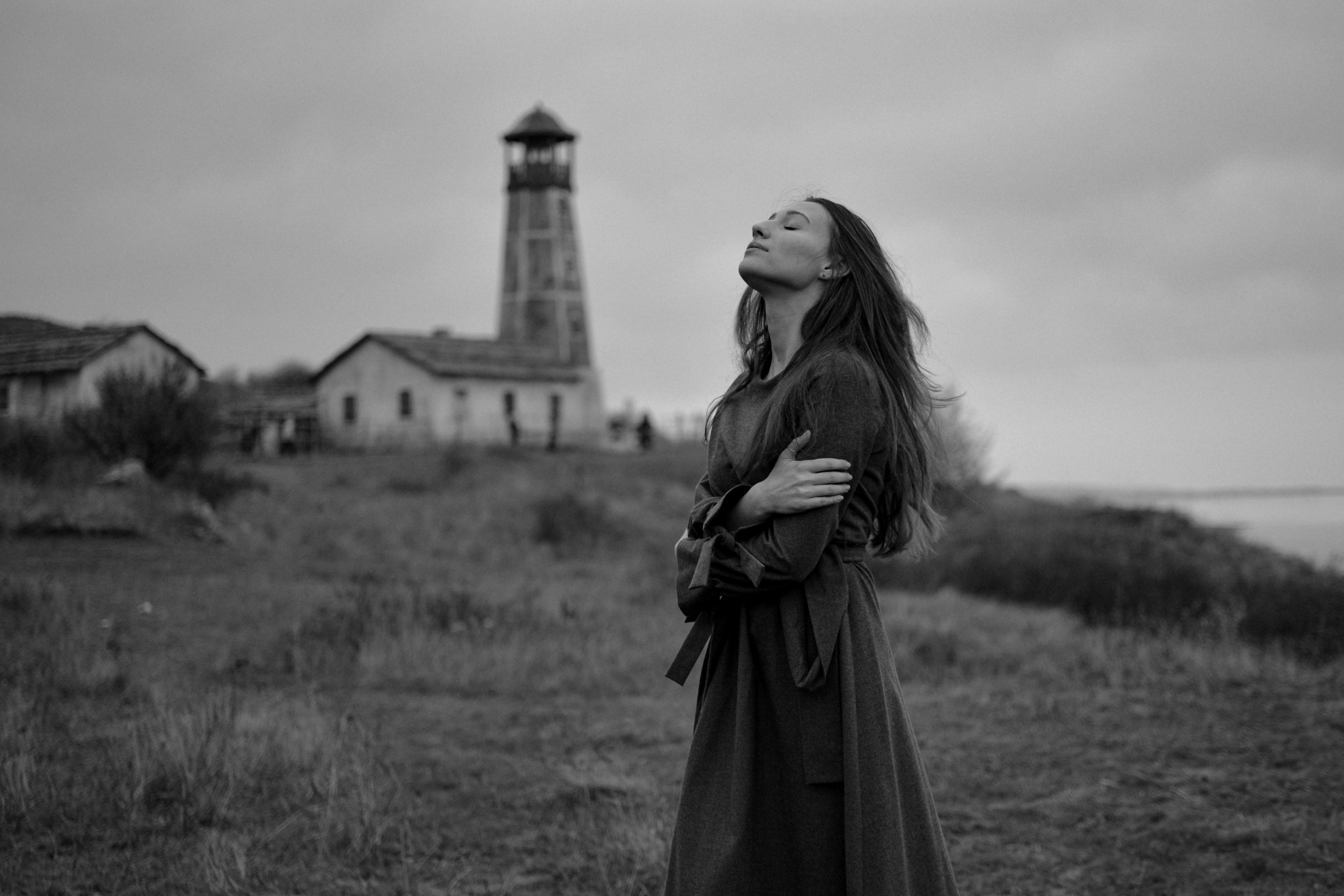
Basic Rules of Photo Composition – There are no clear guidelines for the construction of the composition, but this applies only to the creative component. But when shaping and constructing the future photo one should also take into account the technical aspects that largely determine the result. In this article, we will discuss the basic techniques that photographers should be aware of, regardless of their qualifications. They can also be used if you take pictures with a smartphone. Besides, if you are looking for a smartphone with the best camera right now, we recommend reading an informative article on the official website of the developer Skylum.

Table of Contents
The golden ratio
Correct composition in photography is related to the so-called rule of thirds and the golden ratio. The rule of thirds is to divide the frame horizontally and vertically into three blocks at a ratio of 1 to 2. The horizon line should be in the area of the block that divides the picture into thirds. A large part of the picture is given to the ground or sky, but it depends on the creative idea. The main subject should be at the intersection of lines that divide the frame.
The golden ratio is a slightly different concept. When you divide the picture according to this rule conditional lines are arranged so that the larger part referred to the smaller, and the image as a whole – to the larger. According to the law, the points of intersection are concentrated closer to the center, if compared with the construction by the rule of thirds.
When constructing a picture the grid of the above options is somewhat different. But the basic essence and meaning remain the same:
- The central line of the horizon should be placed with an offset in relation to the middle of the photo so that the picture is conventionally divided in the proportion 1 to 2. At the same time, 2 parts should occupy the ground or sky, according to the idea.
- The main object should be placed on the intersections. This is due to the fact that they attract the eye the most.
Sometimes when you study the rules of composition of the frame it may seem that one law contradicts the other. Yes, there are times when you have to choose which rule to apply in a particular shot. However, you can observe pictures in which several rules are combined harmoniously. This could be, for example, the golden ratio and symmetry, or framing and filling in the picture. You can easily use these rules when you take pictures with the best phone cameras.
Composition is all about symmetry
The basics of composition in photography are also about symmetry. It should not be taken literally in photography. You could say it’s imperfect, but that’s its advantage. After all, the monotony of the frame will quickly bore the viewer, so the special symmetry in the art of photography allows the viewer not only to rest but also to get hooked.
To put it as simply as possible, symmetry is this: if you stack a symmetrical photo along a line, both halves of it will be identical. Symmetry can be of three types:
- Vertical can be expressed, for example, in displaying a vertical tall building or other structure separating the image into two halves.
- Horizontal is often used when taking pictures of reflections on the water surface that create a symmetrical picture.
- Radial is created by symmetrical lines diverging from the center.
Rules of composition in photography and framing
The essence of this method is to place the main object of the frame in a conventional frame, which can be arches, windows, waves, plants, and other elements. The main thing is that the frame and the object do not compete with each other, and complement each other. This method of construction is aimed at revealing the plot and highlighting the main subject, which is emphasized. Framing in composition performs the main tasks:
- Setting the accent and attracting attention.
- Filling the frames with depth, volume, and meaning.
- Creating a peeping effect.
Diagonals and composition techniques
Using the rule of diagonals in photography always makes the composition of the photo more dynamic. Unlike the above laws and techniques, diagonals don’t divide space, but on the contrary, they seem to connect it, thereby leading the viewer’s eye along the entire frame.
Diagonals in photography can be slow and fast. In the first case, it is directed from the lower left corner to the upper right, and in the second it is from the upper opposite to the lower right.
A simple guide to negative space
In photography, the negative is defined as the environment of the subject. It can be anything: a brick wall, snowdrifts, expanse, boardwalk, fog, and more. This space can be inconspicuous or catchy. This technique allows you to create a great composition using phones with the best camera. The effect will be the same as with a professional camera.
Why use this technique when building composition in photography? To evoke the necessary emotions, which should provoke a shot. The result depends solely on the tones used and the immediate type of environment. Calm tones evoke tranquility, catchy ones produce the opposite effect. This technique is also used to create minimalistic photos and simplify the composition of the photograph. This technique is often used to shoot advertising photos to draw the viewer’s attention directly to the product.

Photos with negative space are often sold at photo stocks. Such photos are in demand for several reasons. First, they are somewhat universal, and second, they often have a place for a text. Before you place it on the photo stock must be edited. We suggest trying Luminar Neo if you don’t have time to learn complicated Photoshop tools. All of the above aspects can be used in the composition when you take pictures on the phone. Find a smartphone with the best camera using an article on the Skylum website.


